
 Why Wildfire Experts Are So Worried About This Year’s Fire Season. Inside Climate News, May 2026. With a puny snowpack in the Western mountains and a widespread drought, the nation is a tinderbox. A reorganization of federal firefighting efforts and the departure of many staff qualified to join the fight are heightening concern.
 Trump 2.0 Environmental Case Scorecard. Inside Climate News, November 2025. Tracking federal lawsuits on climate and environmental actions and policies in which the Trump administration is a party. With Marianne Lavelle.
 China Helped Indonesia Build One of the World’s Biggest, Youngest Coal Fleets. It’s Still Growing. Inside Climate News, October 2025. Indonesia is one of the few countries still building new coal power plants, the most polluting sources of power. With Nicholas Kusnetz. Data and analysis.
 Chicago Has a Huge Lead Pipe Problem—and We Mapped It. Inside Climate News, August 2025. Lead water service lines plague the whole city, hitting Black and Latino neighborhoods hardest. With Keerti Gopal, Grist and WBEZ. Methods.
 Agricultural Poisons Tell a Tale of Two Californias. Inside Climate News, December 2024. Documenting exposures to toxic soil fumigants in predominately Latino and Indigenous farmworker communities. With Liza Gross. Data and analysis.
 At What Point Does Driving An Electric Vehicle Get You A Carbon Emissions Payoff? PNAS Front Matter, July 2024. If you are considering buying a new car, SUV, or pickup, you may be bewildered by claims and counterclaims about the green credentials of battery electric vehicles.
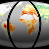 Where Will Climate Change Hit Hardest? These Interactive Maps Offer A Telltale Glimpse. PNAS Front Matter, February 2024. The extent to which the planet warms further has big consequences for local extremes of heat, drought, and precipitation.
 The Climate Crisis, By The Numbers: Your Guide To Humanity’s Greatest Challenge. BuzzFeed News, November 2021. Where our planet stands today, how we got to this point, and what we must do to avoid disaster. With Zahra Hirji.
 These Updating Charts And Maps Show The Coronavirus Pandemic’s Impact Across The US And The World. BuzzFeed News, July 2020. Follow the latest data on COVID-19 globally and in the US. With Jeremy Singer-Vine.
 Here And Now: These Maps Show How Climate Change Has Already Transformed The Earth. BuzzFeed News, April 2019. Our planet is in the grip of rapid climate change. Data and code.
 How Anonymous Are DNA Tests Really? BuzzFeed News, April 2019. Video with this story on the forensic applications of genetic genealogy. Photos by B. A. Van Sise.
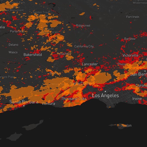 Is Your Home At Risk From Wildfire? Check These Maps. BuzzFeed News, December 2018. We don’t know exactly when and where wildfires will strike, but almost two decades of fire history show the areas at highest risk.
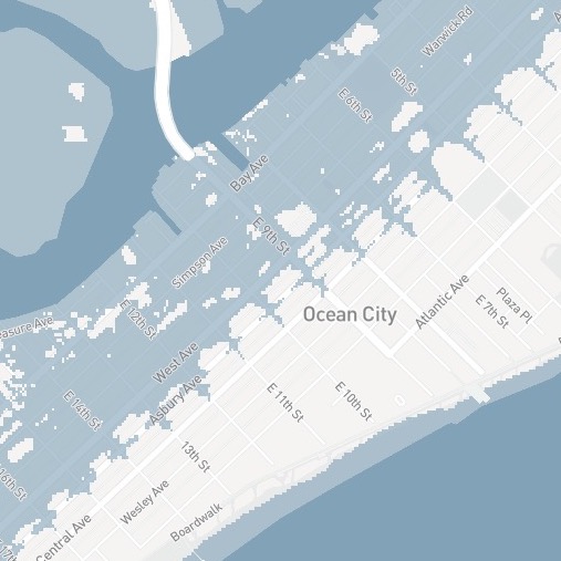 Is Your Home At Risk Of Flooding From Rising Seas By 2050? Check This Map. BuzzFeed News, November 2018. Map with Lo Bénichou of Mapbox, story with Zahra Hirji. Data from Zillow and Climate Central.
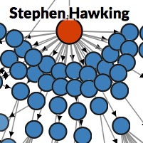 Six Degrees Of Stephen Hawking. March 2018. You probably know the Kevin Bacon game: connect him to any other actor via the fewest shared movies. This is the scientific version, published as a tribute to the late Stephen Hawking, with him in the leading role. With Adam Becker.
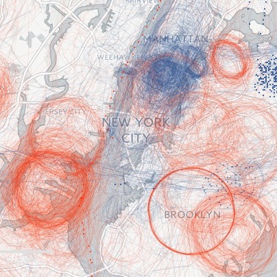 Spies In The Skies. BuzzFeed News, April 2016. Government surveillance planes routinely circle over most major cities — but usually take the weekends off. With Charles Seife. Data and analysis.
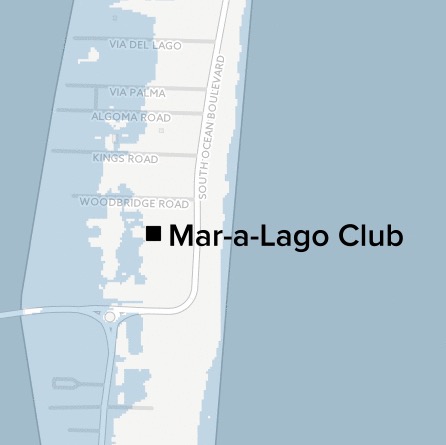 Donald Trump Vs. Sea Level Rise. BuzzFeed News, January 2016. The Republican presidential frontrunner dismisses climate change as a hoax. Here’s what rising sea levels could do to the buildings that bear his name.
 It’s Official: 2015 Was The Hottest Year On Record. BuzzFeed News, January 2016. 136 years of climate change in 21 seconds. Video made from NASA’s historical surface temperature data.
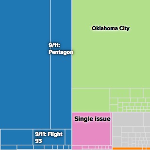 5 Charts That Show What Terrorism In America Looks Like. BuzzFeed News, November 2015. Violent extremism in the U.S. has many faces — mostly American faces. Many are not jihadis.
 Data Canvas Sensor Log. February 2015. I took part in Data Canvas: Sense Your City, a project to deploy 100 sensor nodes in seven cities around the world. This app displays the output from my sensors in San Francisco.
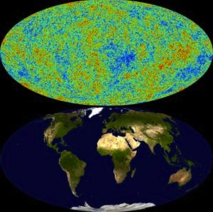 Cosmic Ripples Come Into Focus. New Scientist, March 2013. Just how sharp is the Planck satellite’s new view of the cosmic microwave background? With Adam Becker.
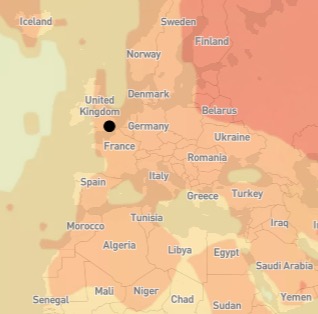
 Your Warming World. New Scientist, January 2013. The heat is on for the planet as a whole, but what has been happening where you live? With Chris Amico.
 Four Ways To View The World’s Well-Being. September 2012. GDP is not the only lens through which to observe the wealth of nations.