Data visualization: basic principles
Why visualize data? It is a good way to communicate complex information, because we are highly visual animals, evolved to spot patterns and make visual comparisons. To visualize effectively, however, it helps to understand a little about how our brains process visual information. The mantra for this week’s class is: Design for the human brain!
Visualization: encoding data using visual cues
Whenever we visualize, we are encoding data using visual cues, or “mapping” data onto variation in size, shape or color, and so on. There are various ways of doing this, as this primer illustrates:
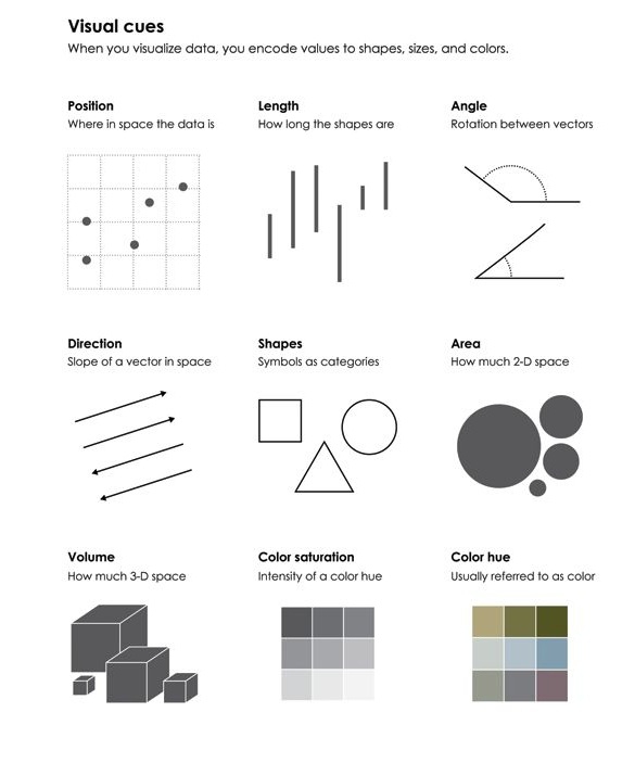
(Source: Nathan Yau, Data Points)
These cues are not created equal, however. In the mid-1980s, statisticians William Cleveland and Robert McGill ran some experiments with human volunteers, measuring how accurately they were able to perceive the quantitative information encoded by different cues. This is what they found:
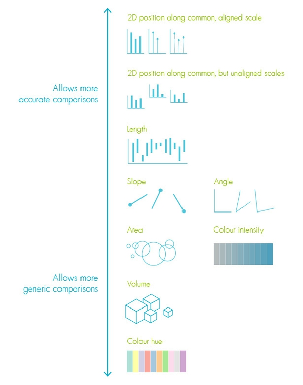
(Source: Creative Bloq)
This perceptual hierarchy of visual cues is important. When making comparisons with continuous variables, aim to use cues near the top of the scale wherever possible.
That doesn’t mean the other possibilities are always to be avoided in visualization — indeed, color hue can a good way of encoding categorical data. The human brain is particularly good at recognizing patterns and differences. This means that variations in color, shape and orientation, while poor for accurately encoding the precise value of continuous variables, can be good choices for representing categorical data.
You can also combine different visual cues into the same graphic to encode different variables. But always think about the main messages you are trying to impart, and try to use visual cues that will communicate that message most effectively.
To witness this perceptual hierarchy, look at the following visual encodings of the same simple dataset. In which of the three charts is it easiest to compare the numerical values that are encoded?
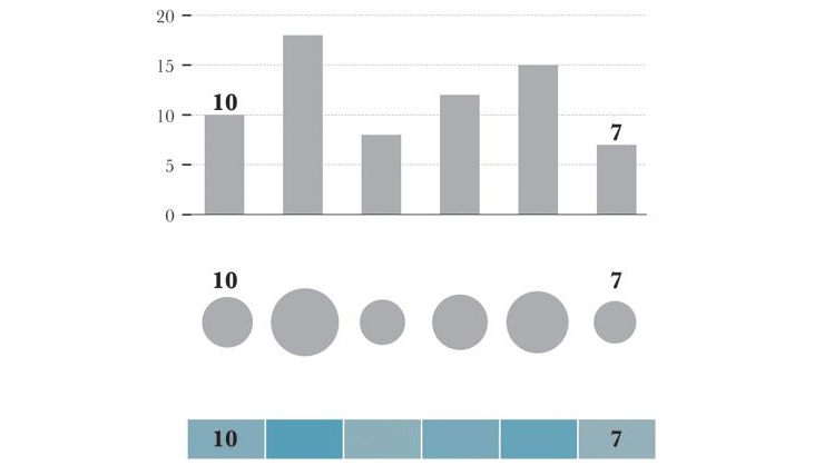
(Source: Alberto Cairo, The Functional Art)
If you have spent any time reading blogs on data visualization, you will know the disdain in which pie charts are often held. It should be clear which of these two charts is easiest to read:
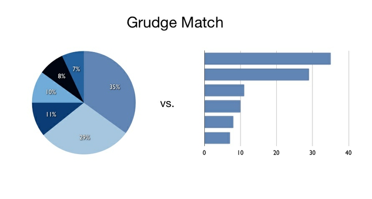
(Source: VizThinker)
Pie charts encode continuous variables using the angles made in the center of the circle. It is certainly true that angles are harder read accurately than aligned bars. However, note that encoding data using the area of circles — which has become a “fad” in data visualization in recent years — makes even tougher demands on your audience.
Which chart type should I use?
This is a frequently asked question, and the best answer is: Experiment with different charts, to see which works best to liberate the story in your data. Some of the visualization software that we’ll work with subsequently — notably Tableau Public — will suggest chart types for you to try. However, it is good to have a basic framework to help you prioritize particular chart types for particular visualization tasks. Although it is far from comprehensive, and makes some specific chart suggestions that I would not personally endorse, this “chart of charts” provides a useful framework by providing four answers to the question: “What would you like to show?”
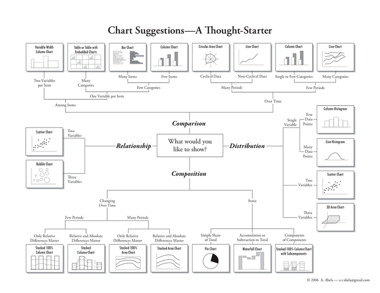
(Source: A. Abela, Extreme Presentation Method)
In week 1, we covered charts to show the distribution of a single continuous variable, and to study the relationship between two continuous variables. So let’s now explore possibilities for comparison between items for a single continuous variable, and composition, or how parts make up the whole. In each case, this framework considers both a snapshot at one point in time, and how to visualize comparison and composition over time — a common task in data journalism.
Simple comparisons: bars and columns
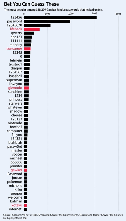
Applying the perceptual hierarchy of visual cues, bar and column charts are usually the best options for simple comparisons. Vertical columns often work well when few items are being compared, while horizontal bars may be a better option when there are many items to compare, as in this example, illustrating common passwords revealed by a 2013 data breach at Gawker Media:
(Source: Digits blog, The Wall Street Journal)
Notice how color is used here as a secondary visual cue, to highlight passwords that include the names of Gawker’s own sites.
There is one sacrosanct rule with bar and column charts: Because they rely on the length of the bars to encode data, you must start the bars at zero. Failing to do this will mislead your audience. Several graphics aired by Fox News have been criticized for disobeying this rule, for example:
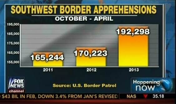
(Source: Fox News, via Media Matters for America)
Comparisons: change over time
Bar or column charts can also be used to illustrate change over time, but there are other possibilities, as shown in these charts showing participation in the federal government’s food stamps nutritional assistance program, from 1969 to 2013.
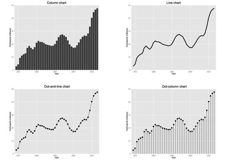
(Source: Peter Aldhous, from U.S. Department of Agriculture data)
Each of these charts communicates the same basic information with a subtly different emphasis. The column chart emphasizes each year as a discrete point in time, while the line chart focuses on the overall trend or trajectory. The dot-and-line chart is a compromise between these two approaches, showing the trend while also drawing attention to the value for each year. (The dot-column chart is an unusual variant of a column chart, included here to show another possible design approach.)
Multiple comparisons, including over time
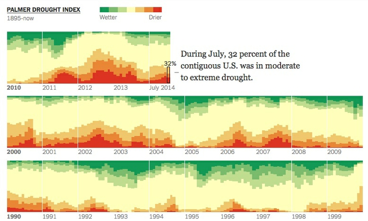
When comparing very many items, or how one item has changed over time, “small multiples” provide another approach. They has been used very successfully in recent years by several news organizations. Here is a small section from a larger graphic showing the severity of drought in California in late 2013 and early 2014:
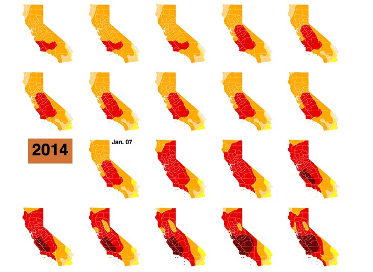
(Source: Los Angeles Times)
Small multiples are becoming more popular as more people consume news graphics on mobile devices. Unlike larger conventional graphics, they can be made to reflow easily in responsive web designs to display effectively on small screens.
If you are comparing two points in time for many items, a slope graph can be an effective choice. Slope falls about midway on the perceptual hierarchy of visual cues, but allows us to scan many items at once and note obvious differences. Here I used slope graphs to visualize data from a study examining the influence of putting house plants in hospital rooms on patient’s sense of well-being, measured before abdominal surgery, and after a period of recovery. I used thicker lines and color to highlight ratings that showed statistically significant improvements.
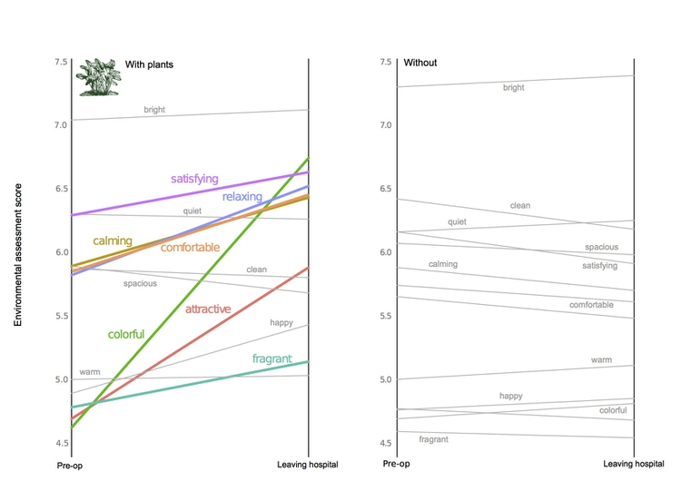
(Source: Peter Aldhous, from data in this research paper)
Composition: parts of the whole
This is where the much-maligned pie chart does have a role, although it is not the only option. Which of these two representations of an August 2014 poll of public opinion on President Barack Obama’s job performance makes the differences between his approval ratings for difference policy areas easiest to read, the pie charts or the stacked column charts below?
These graphics involve both comparison and composition — a common situation in data journalism. Note also the use of color: The darker, more intense shade of blue serves to highlight the percentage of the public that approves of Obama’s performance, while a neutral gray is used for the “unsures,” to de-emphasize this category and draw attention to the difference between the size of the “approve” and “disapprove” values.
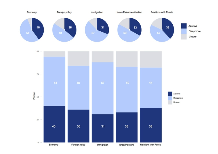
(Source: Peter Aldhous, from CBS poll data, via PollingReport.com)
I would suggest abandoning pie charts if there are any more than three parts to the whole, as they become very hard to read when there are many segments. ProPublica’s graphics style guide goes further, allowing pie charts with two segments only.
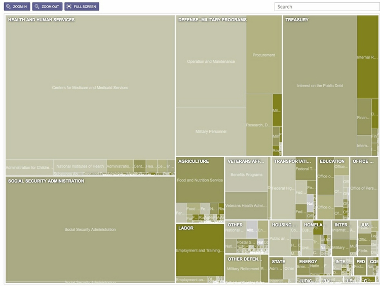
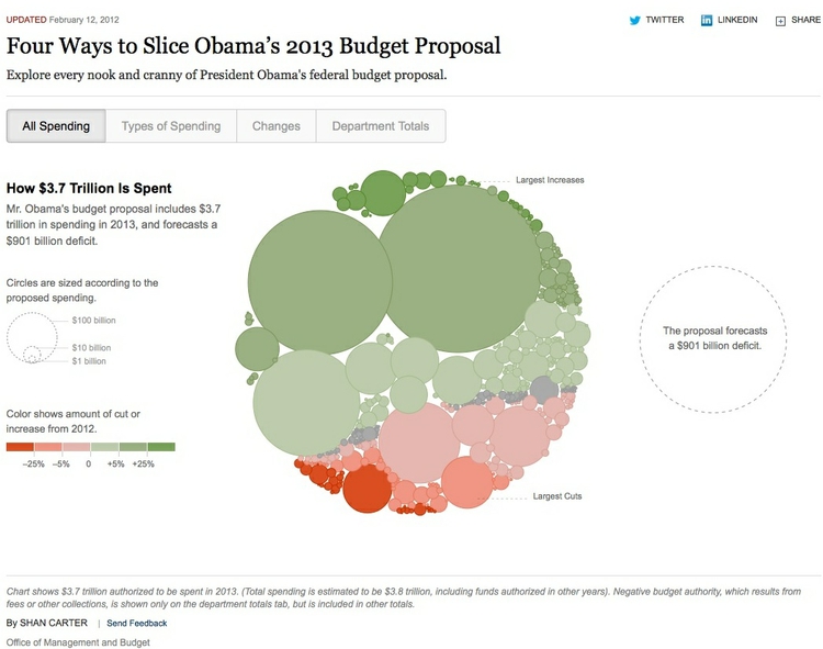
Another approach, known as a treemap, uses area to encode the size of parts of the whole. Although area falls lower on the perceptual hierarchy of visual cues than position/length, it can be effective to display “nested” variables — where each part of the whole is broken down into further parts. Here The New York Times used a treemap to display President Obama’s 2012 budget request to Congress, also using color to indicate whether the proposal represented an increase (shades of green) or decrease (red) in spending:
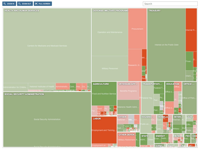
(Source: The New York Times)
Composition: change over time
Data journalists frequently need to show how parts of the whole vary over time. Here is an example, illustrating the development of drought across the United States, which uses a stacked columns format, in this case with no space between the columns.
(Source: The Upshot, The New York Times)
In this example, the size of the whole remains constant. Even if the size of the whole changes, this format can be used to show changes in the relative size of parts of the whole, by converting all of the values at each time interval into percentages of the total.
Stacked column charts can also be used to simultaneously show change in composition over time and change in the size of the whole. This example is from one of my own articles, looking at change over time in the numbers of three categories of scientific research papers in published in Proceedings of the National Academy of Sciences:
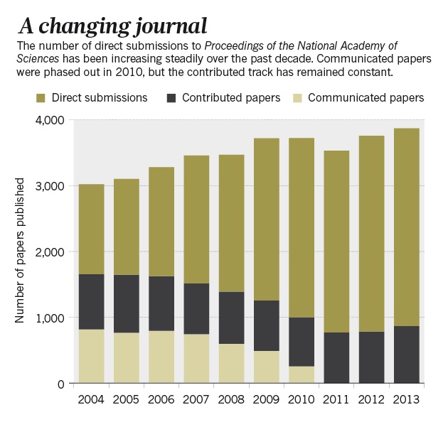
(Source: Nature)
Just as for simple comparisons over time, columns are not the only possibility when plotting changes in composition over time. The equivalent of the line chart, stressing the overall trend rather than values at discrete points in time, is the stacked area chart. Again, these charts can be used to show change of time with the size of the whole held constant, or varying over time. This 2009 interactive from the The New York Times used this format to reveal how Americans typically spend their day:
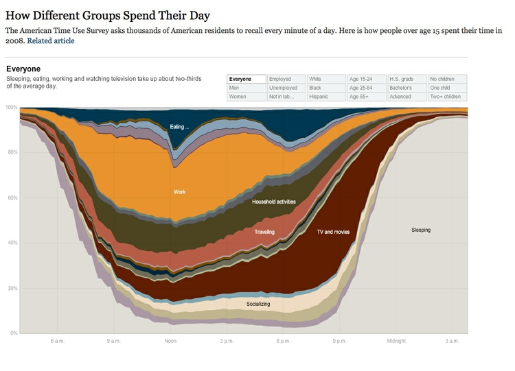
(Source: The New York Times)
Making connections: network graphs
The chart types thought-starter we have used as a framework so far misses out one important answer to the question: “What would you like to show?” Journalists are frequently interested in exploring connections — which donors gave money to which candidate, how companies are connected through members of their boards, and so on. Network graphs can visualize these questions, and are sometimes used in news media. Here, for example, The New York Times showed connections between the national teams, players and club teams at the 2014 soccer World Cup:
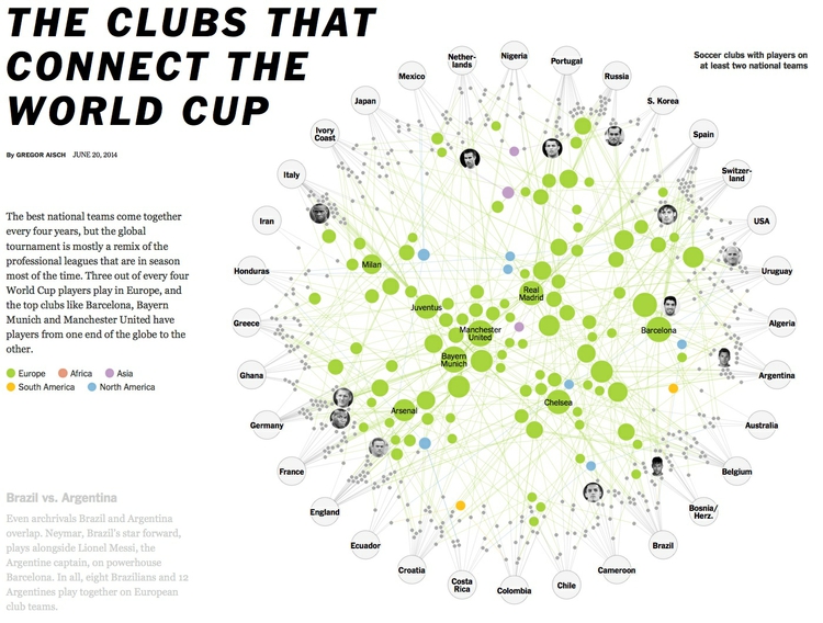
(Source: The New York Times)
Complex network graphs can be very hard to read — “hairball” is an oft-used pejorative term — so networks will often need to be filtered to tell a clear story to your audience. We will explore drawing network graphs in a later class.
Using color effectively
Color falls low on the perceptual hierarchy of visual cues, but as we have seen above, it is often deployed to highlight particular elements of a chart, and sometimes to encode data values. Poor choice of color schemes is a problem that bedevils many news graphics, so it is worth taking some time to consider how to use color to maximum effect.
It helps to think about colors in terms of the color wheel, which places colors that “harmonize” well together side by side, and arranges those that have strong visual contrast — blue and orange, for instance — at opposite sides of the circle:
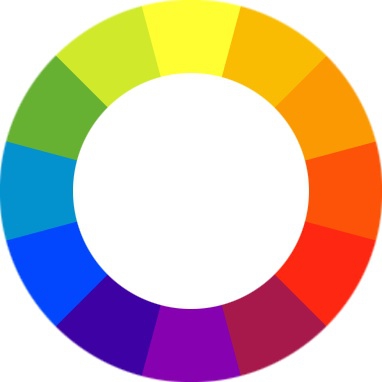
(Source: Wikimedia Commons)
When encoding data with color, take care to fit the color scheme to your data, and the story you’re aiming to tell. As we have already seen, color is often used to encode the values of categorical data. Here you want to use “qualitative” color schemes, where the aim is to pick colors that will be maximally distinctive, as widely spread around the color wheel as possible:
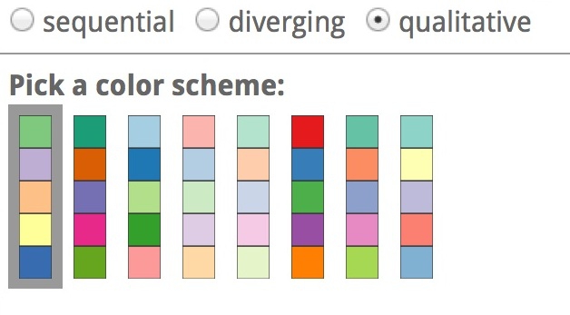
(Source: ColorBrewer)
When using color to encode continuous data, it usually makes sense to use increasing intensity, or saturation of color to indicate larger values. These are called “sequential” color schemes:
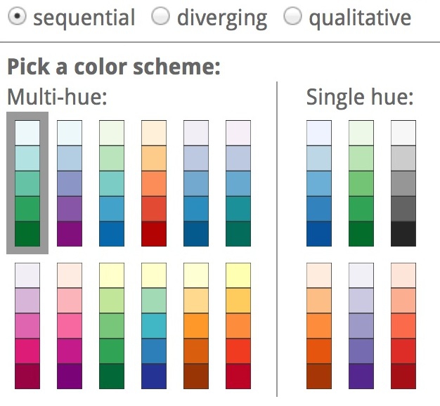
(Source: ColorBrewer)
In some circumstances, you may have data that has positive and negative values, or which highlights deviation from a central value. Here, you should use a “diverging” color scheme, which will usually have two colors reasonably well separated on the color wheel as its end points, and cycle through a neutral color in the middle:

(Source: ColorBrewer)
Choosing color schemes is a complex science and art, but there is no need to “roll your own” for every graphic you make. Many visualization tools include suggested color palettes, and I often make use of the website from which the examples above were taken, called ColorBrewer. Orginally designed for maps, but useful for charts in general, these color schemes have been rigorously tested to be maximally informative.
In class, we will take some time to play around with ColorBrewer and examine its outputs. You will notice that the colors it suggests can be displayed according to their values on three color “models”: HEX, RGB and CMYK. Here is a brief explanation of these and other common color models.
RBG Three values, describing a color in terms of combinations of red, blue and green light, with each scale ranging from 0 to 255; sometimes extended to RGB(A), where A is alpha, which encodes transparency. Example:
rgb(169, 104, 54).HEX A six-figure “hexadecimal” encoding of RGB values, with each scale ranging from hex 00 (equivalent to 0) to hex ff (equivalent to 255); HEX values will be familiar if you have any experience with web design, as they are commonly used to denote color in HTML and CSS. Example:
#a96836CMYK Four values, describing a color in combinations of cyan, magenta, yellow and black, relevant to the combination of print inks. Example:
cmyk(0, 0.385, 0.68, 0.337)HSL Three values, describing a color in terms of hue, saturation and lightness (running from black, through the color in question, to white). Hue is the position on a blended version of the color wheel in degrees around the circle ranging from 0 to 360, where 0 is red. Saturation and lightness are given as percentages. Example:
hsl(26.1, 51.6%, 43.7%)HSV/B Similar to HSL, except that brightness (sometimes called value) replaces lightness, running from black to the color in question.
hsv(26.1, 68.07%, 66.25%)
Colorizer is one of several web apps for picking colors and coverting values form one model to another.
Custom color schemes can also work well, but experiment to see how different colors influence your story. The following graphic from The Wall Street Journal, for instance, uses an unusual pseudo-diverging scheme to encode data — the US unemployment rate — that would typically be represented using a sequential color scheme. It has the effect of strongly highlighting periods where the jobless rate rises to around 10%, which flow like rivers of blood through the graphic. This was presumably the designer’s aim.
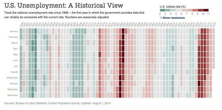
(Source: The Wall Street Journal)
If you intend to roll your own color scheme, try experimenting with I want hue for qualitative color schemes, the Chroma.js Color Scale Helper for sequential schemes, and this color ramp generator, in combination with Colorizer or another online color picker, for diverging schemes.
You will also notice that ColorBrewer allows you to select color schemes that are colorblind safe. Surprisingly, many news organizations persist in using color schemes that exclude a substantial minority of their audience. Red and green lie on opposite sides of the color wheel, and also can be used to suggest “good” or “go,” versus “bad” or “stop.” But about 5% of men have red-green colorblindness, also known as deuteranopia. Here, for example, is what the budget treemap from The New York Times would look like to someone with this condition:
(Source: The New York Times via Color Oracle)
Install Color Oracle to check how your charts and maps will look to people with various forms of colorblindness.
Using chart furniture, minimizing chart junk, highlighting the story
In addition to the data, encoded through the visual cues we have discussed, various items of chart furniture can help frame the story told by your data:
Title and subtitle These provide context for the chart.
Coordinate system For most charts, this is provided by the horizontal and vertical axes, giving a cartesian system defined by X and Y coordinates; for a pie chart it is provided by angles around a circle, called a polar coordinate system.
Scale Labeled tick marks and grid lines can help your audience read data values.
Labels You will usually want to label each axis. Think about other labels that may be necessary to explain the message of your graphic.
Legend Where you use color or shape to encode data, you will usually need a legend to explain this encoding.
Chart furniture can also be used to encode data, as in this example, which shows the terms of New York City’s police commissioners and mayors with reference to the time scale on the X axis:
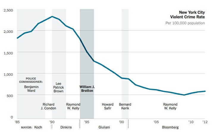
(Source: The New York Times)
In this example, the label for the Y axis is displayed horizonatally in the main chart area, rather than vertically alongside the chart. News media often do this so that readers don’t have to crane their necks to read the label. If you do this, check that it is clear to users that the label refers to scale on the Y axis.
Think carefully about how much chart furniture you really need, and make sure that the story told by your data is front and center. Think data-ink: What proportion the ink or pixels in your chart is actually encoding data, and what proportion is embellishment, adding little to your story?
Here is a nice example of a graphic that minimizes chart junk, and maximizes data-ink. Notice how the Y axis doesn’t need to be drawn, and the gridlines are an absence of ink, consisting of white lines passing through the columns:

(Source: The Upshot, The New York Times)
Contrast this with the proliferation of chart junk in the earlier misleading Fox News column chart.
Labels and spot-color highlights can be particularly useful to highlight your story, as shown in the following scatter plots, used here to show the relationship between the median salaries paid to women and men for the same jobs in 2013. In this case there is no suggestion of causation; here the scatter plot format is being used to display two distributions simultaneously — see the chart types thought-starter.
It is clear from the first, unlabeled plot, that male and female salaries for the same job are strongly correlated, as we would expect, but that relationship is not very interesting. Notice also how I have used transparency to help distinguish overlapping individual points.
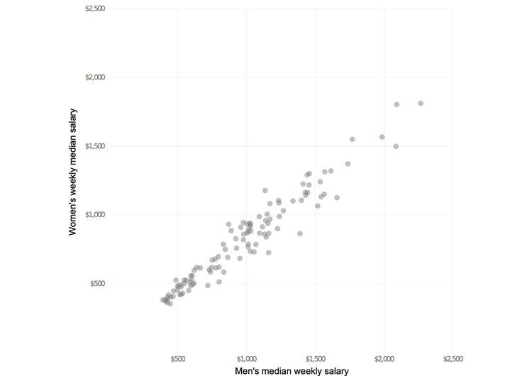
(Source: Peter Aldhous, from Bureau of Labor Statistics data)
What we are interested in here is whether men and women are compensated similarly for doing the same jobs. The story in the data starts to emerge if you add a line of equal pay, with a slope of 1 (note that this isn’t a trend line, as we discussed last week). Here I have also highlighted the few jobs in which women in 2013 enjoyed a marginal pay gap over men:
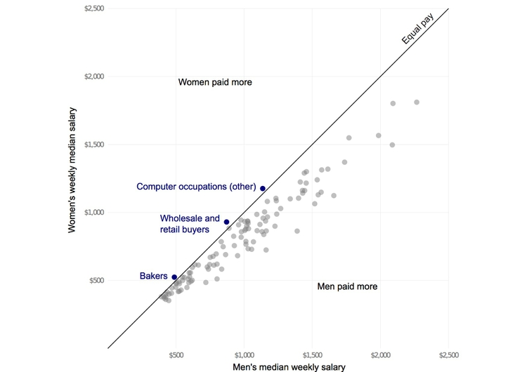
(Source: Peter Aldhous, from Bureau of Labor Statistics data)
Notice how adding another line, representing a 25% pay gap, and highlighting the jobs where the pay gap between men and women is largest, emphasizes different aspects of the story:
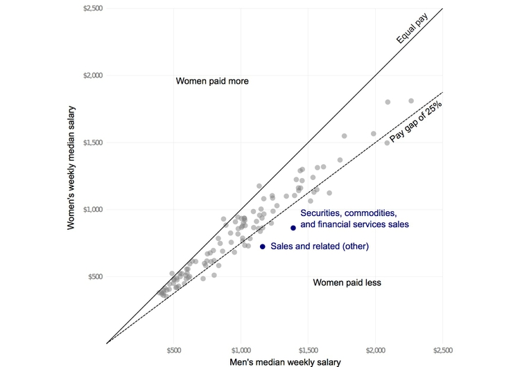
(Source: Peter Aldhous, from Bureau of Labor Statistics data)
Other pitfalls to avoid
If you ever decide to encode data using area, be sure to do so correctly. Hopefully it is obvious that if one unit is a square with sides of length one, then the correct way to represent a value of four is a square with sides of length two (2*2 = 4), not a square with sides of length four (4*4 = 16).
Mistakes are frequently made, however, when encoding data by the area of circles. In 2011, for instance, President Barack Obama’s State of the Union Address for the first time included an “enhanced” online version with supporting data visualizations. This included the following chart, comparing US Gross Domestic Product to that of competing nations:

(Source: The 2011 State of the Union Address: Enhanced Version)
Data-savvy bloggers were quick to point out that the data had been scaled by the radius of each circle, not its area. Because area = π * radius^2, you need to scale the circles by the square root of the radius to achieve the correct result, on the right:
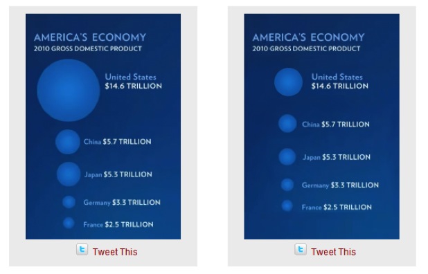
(Source: Fast Fedora blog)
Many software packages (Microsoft Excel is a notable culprit) allow users to create charts with 3-D effects. Some graphic designers produce customized charts with similar aesthetics. The problem is that that it is very hard to read the data values from 3-D representations, as this example illustrates:
(Source: Good)
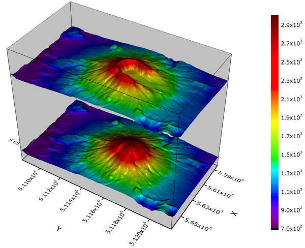
A good rule of thumb for data visualization is that trying to represent three dimensions on a two dimensional printed or web page is almost always one dimension too many, except in unusual circumstances, such as these representations of Mount St. Helens in Washington State, before and after its 1980 eruption:
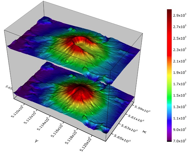
(Source: OriginLab)
Above all, aim for clarity and simplicity in your chart design. Clarity should trump simplicity. As Albert Einstein is reputed to have said: “Everything should be made as simple as possible, but not simpler.”
Sometimes even leading media outlets lose their way. See if you can make sense of this interactive graphic on clandestine US government agencies and their contractors:
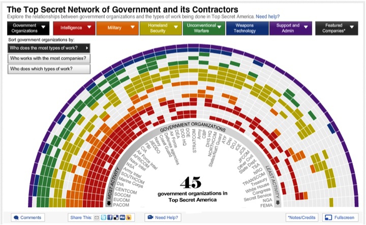
(Source: The Washington Post)
Be true to the ‘feel’ of the data
Think about what the data represents in the real world, and use chart forms, visual encodings and color schemes that allow the audience’s senses to get close to what the data means — note again the “rivers of blood” running through The Wall Street Journal’s unemployment chart, which suggest human suffering.
The best example I know of this uses sound rather than visual cues, so strictly speaking it is “sonification” rather than visualization. In 2010, this interactive from The New York Times explored the narrow margins separating medalists from also-rans in many events at the Vancouver Winter Olympics. It visualized the results in a conventional way, but also included sound files encoding the race timings with musical notes.
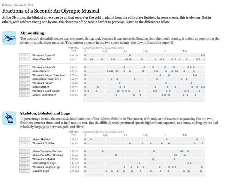
(Source: The New York Times)
Our brains process music in time, but perceive charts in space. That’s why the auditory component of this interactive was the key to its success.
Break the story down into scenes
Many stories have a step-by-step narrative, and different charts may tell different parts of the story. So think about communicating such stories through a series of graphics. This is another good reason to experiment with different chart types when exploring a new dataset. Here is a nice example of this approach, examining demographic change in Brazil:
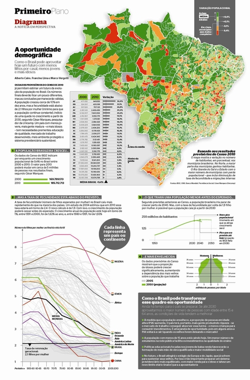
(Source: Época, via Visualopolis)
Good practice for interactives
Nowadays the primary publication medium for many news graphics is the web, rather than print, which opens up many possibilities for interactivity. This can greatly enhance your ability to tell a story, but it also creates new possibilities to confuse and distract your audience — think of this as interactive chart junk.
A good general approach for interactive graphics is to provide an overview first, and then allow the interested user to zoom or filter to dig deeper into the data. In such cases, the starting state for an interactive should tell a clear story: If users have to make an effort to dig into a graphic to get anything from it, few are likely to do so. Indeed, assume that much of your audience will spend only a short time interacting with the data. “How Different Groups Spend Their Day” from The New York Times is a good example of this approach.
Similarly, don’t hide labels or information essential to understanding the graphic in tooltips that are accessed only on clicks or hovers. This is where to put more detailed information for users who have sufficient interest to explore further.
Make the controls for an interactive obvious — play buttons should look like play buttons, for instance. You can include a few words of explanation, but only a very few: as far as possible, how to use the interactive should be intuitive, and built into its design.
The interactivity of the web also facilitates a scene-by-scene narrative — a device employed frequently by The New York Times‘ graphics team in recent years. With colleagues at New Scientist, I also used this approach for this interactive, exploring the likely number of Earth-like planets in our Galaxy:
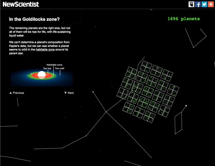
(Source: New Scientist)
Animation in interactives can be very effective. But remember the goal of staying true to the ‘feel’ of the data. Animated images evolve over time, so animation can be particularly useful to encode data that changes over time. But again you need to think about what the human brain is able to perceive. Research has shown that people have trouble tracking more than about four points at a time. Try playing Gapminder World without the energetic audio commentary of Hans Rosling’s “200 Countries” video, and see whether the story told by the data is clear.
Animated transitions between different states of a graphic can be pleasing. But overdo it, and you’re into the realm of annoying Powerpoint presentations with items zooming into slides with distracting animation effects. It’s also possible for elegant animated transitions to “steal the show” from the story told by the data, which arguably is the case for this exploration by The New York Times of President Obama’s 2013 budget request to Congress:
(Source: The New York Times)
Sketch and experiment to find the story
The message I’d like you to take from this class is that there are many ways of visualizing the same data. Effective static graphics and interactives do not usually emerge fully formed. They usually arise through sketching and experimentation. Kevin Quealy’s chartsnthings blog provides a great window into how this process works on the graphics desk of The New York Times.
As you sketch and experiment with data, use the framework suggested by the chart selector thought-starter to prioritize different chart types, and definitely keep the perceptual hierarchy of visual cues at the front of your mind. Remember the mantra: Design for the human brain!
Also, show your experiments to friends and colleagues. If people are confused or don’t see the story, you made need to try a different approach.
Learn from the experts
Over the coming weeks and beyond, make a habit of looking for innovative graphics, especially those employing unusual chart forms, that communicate the story from data in an effective way. Work out how they use visual cues to encode data. Here are a couple of examples from The New York Times to get you started. Follow the links from the source credits to explore the interactive versions:
(Source: The New York Times)
(Source: The New York Times)
Similarly, make note of graphics that communicate less effectively, and see if you can work out why.
Assignment
- By start of next week’s class, complete this quiz on principles of data analysis and visualizaton.
Further reading
Alberto Cairo: The Functional Art: An Introduction to Information Graphics and Visualization
Nathan Yau: Data Points: Visualization That Means Something